There are three factors you need to consider while selecting fonts for your presentation slides: tone, readability and consistency.
Fonts have their personality and they convey certain mood and feeling. Are you presenting something formal and professional or are you presenting something cool and casual? You have to select the fonts that can set the right tone of your presentation. You should also ensure that the fonts you have selected are easy to read and you are using a consistent set of fonts throughout the presentation.
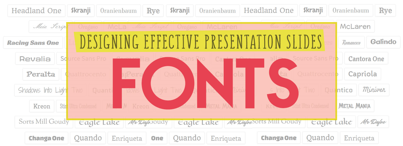
Standard Fonts vs. Custom Fonts
Every computer comes with a set of standard fonts pre-installed and those standard fonts will remain stable across all platforms. You can add custom fonts to your font library. But those custom fonts are not guaranteed to display correctly from computer to computer. When viewing a presentation on a computer that does not already have the font installed, custom fonts will be replaced with a standard option. Therefore it is safe to use standard fonts.
But using standard fonts does not mean you need to stick with boring uninspiring fonts. Standard fonts such as Futura, Calibri, Garamond, Helvetica, Gill Sans and Rockwell can sufficiently give your slides elegant and professional look and feel.

Read More:
6 Classic Fonts (That Come With PowerPoint) that Will Wow Your Audience!
How can you use Custom fonts
While it is safe to use standard fonts and most of the times sufficient, there might be occasions when you want to give more personality to your presentation. You might want to go for more elegant look or bolder or more whimsical look. The issue is that your custom font might not be installed on the computer you will be using during the presentation.
To handle this, you can embed fonts within the powerpoint slides (check this video tutorial to embed fonts) . But it is also true that font embedding will increase the size of the file.
Another option is to save a single slide or all slides as images.
You can download free custom fonts from various sources such as Google Fonts, Font Squirrel, and DaFont.
Read More:
9 Ways to Make Your PowerPoint Presentation Dazzle Using Fonts
Our favourite custom fonts for PowerPoint, Buffalo7
10 Best Places to Find Free Fonts
23 great places to download fonts for free
Stick with 2-3 number of font types for consistency
After you make the choice of font types, stick with 2 or 3 number of font types. If you use too many different font types, you will lose design consistency. Decide which fonts you will use for headings, sub-headings and body and then stick to them across all slides in your presentation. You can also use different weights of the same font type to create the hierarchy while also maintaining the design consistency.
Choose font size that is big enough
Using too small font makes it hard for the audience to read the text. Take note of the size of the room you’ll be presenting in and make sure that the audience at the back is able to read it. The general advice is using font size 28-34 points for the body and not using fonts smaller than 24 points.
More from Chautaari
Designing Effective Presentation Slides| Part 1: Common Design Mistakes (Infographics)
Designing Effective Presentation Slides| Part 2: Handling Text-Heavy Content
Author: Dovan Rai
Dovan is passionate about education technology and worked at OLE Nepal, where she designed educational software for public schools in Nepal. She has a PhD in Computer Science from Worcester Polytechnic Institute, USA
Leave a Reply